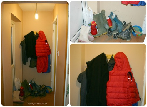
When we moved into our house eight years ago, one of the things that appealed to use was the outbuildings which had been converted into a wet room, with back garden access. We had it changed into a utility room and toilet, and the 'back porch' (as I call it) was a vital pathway through from the garden to the 'washroom' after gardening. I also knew that once we had a child that it would be an essential as it would enable him to run through without worrying about getting the carpet dirty.
So we painted the back porch the same colour as the kitchen (a burnt terracotta), laid some tiles, hung up a row of coat hooks and that was the job done!
Until a month or so ago when a blogging friend came to visit for the first time and I realised what an absolute mess it was and how embarrassed I was of the dumping ground for wellies, macs, seed trays, frisbees, trowels, and general things to go down to the shed.

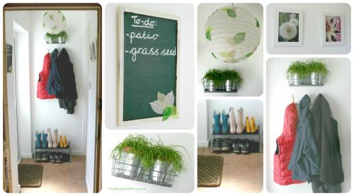
About a week ago, I received an e-mail from Money Supermarket asking me if I'd like to take part in their Room For Improvement competition, where they would give me £50 to improve a room or area of the house. The 'back porch' screamed at me, begging me to make it feel loved and not like the ugly sister to the rest of the house, so I accepted, received the £50 and set off to Ikea for some goodies.
I bought:
- wire basket = £1.50
- 2 x plant pots = £1.90
- 2 x potted plant = £8.50
- shoe rack = £5.00
- I also bought some kitchen and bathroom paint from B&Q which cost £19.98.
- While on holiday I nabbed a chalkboard, a paper lampshade and some craft skeleton leaves from a cheap touristy shop, which totalled £7.75. And from the cheerful chappy at the market on Saturday I spent £5.00 on a door mat to help keep the floor a little cleaner!
- 2 x photos = 24p
Total Spend = £49.87!

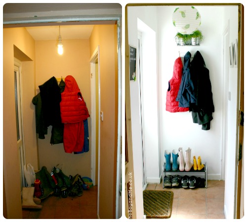
Here it is, a before and after comparison:

What do you think?


It's such an improvement, I love this campaign fab idea!
Wow! It's made such a difference. It looks so light now. I really love the lampshade. And the plant pots in the wire basket, they look so effective.
Love it! I did the porch too, yours is so lovely! Love the colours too 🙂
xx
Love it. The lampshade looks lovely, such a clever idea!
I really like it, nice to see clean and white, it makes it so much lighter x
Wow, that's such a big improvement. I'm loving all of these entries to the challenge, I did mine today too.
wow what a great transformation ! you have done a great job and the white was a great choice of colour because it makes it seemed lighter and less dark of a space and cleaner and fresher. i love how you have brought a little of the outdoors indoors with the greenery and that lampshade. sooooo much better well done x
It looks great, so much lighter!
Amazing what you can achieve for £50, I've been so impressed with this challenge!
Wow that's made such a big difference. Amazing what some fresh bright paint and accessories will do isn't it?
Wow what a remarkable job.
It looks so fresh and clean
I'm loving these home improvement posts. 50 pounds doesn't seem like that much but it makes such a difference. Looks so much more airier, fresher and bigger even.
Much better — love what people are acheiving with £50.
Looks so much brighter and somehow bigger. Really well done!
Wow that is fantastic!
Looks great. Loving seeing what people have done on £50
Really great transformation
What a lovely, clean, fresh space!
Hey, it looks great! Well done x
I love the transformation and the lampshade is brilliant xx
Wow what an improvement! Amazing achievement!
This is lovely, so bright and fresh. The plants are a lovely touch as well, so nice to bring a little bit of the garden indoors.
We’re new to your blog and enjoying it very much!